Burlington Contemporary
Communicating narratives in contemporary art with a new online journal by The Burlington Magazine, powered by our Qi CMS.
CMS, Information Architecture, Wireframes (UX/UI), Art Direction, Development, Accessibility
Visit website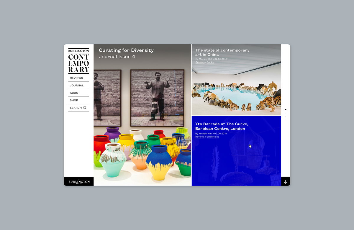
Understanding audiences
Burlington Contemporary, a free-access academic journal, advances the commitment of the long-established Burlington Magazine to the study of international contemporary art.
As part of a wider rebranding exercise involving both the print and online editions of The Burlington Magazine, this new online platform focused on the contemporary art world is intended to increase awareness of the Burlington brand as a whole, as well as address the question of how to write art history for art made today and offer free access to rigorous scholarship on recent art
Based on research on The Burlington’s existing readership and prospective readers (students and academics specialised in contemporary art), which will enlarge their core readership, we gathered insights and developed user profiles which guided our design process.
Reviews
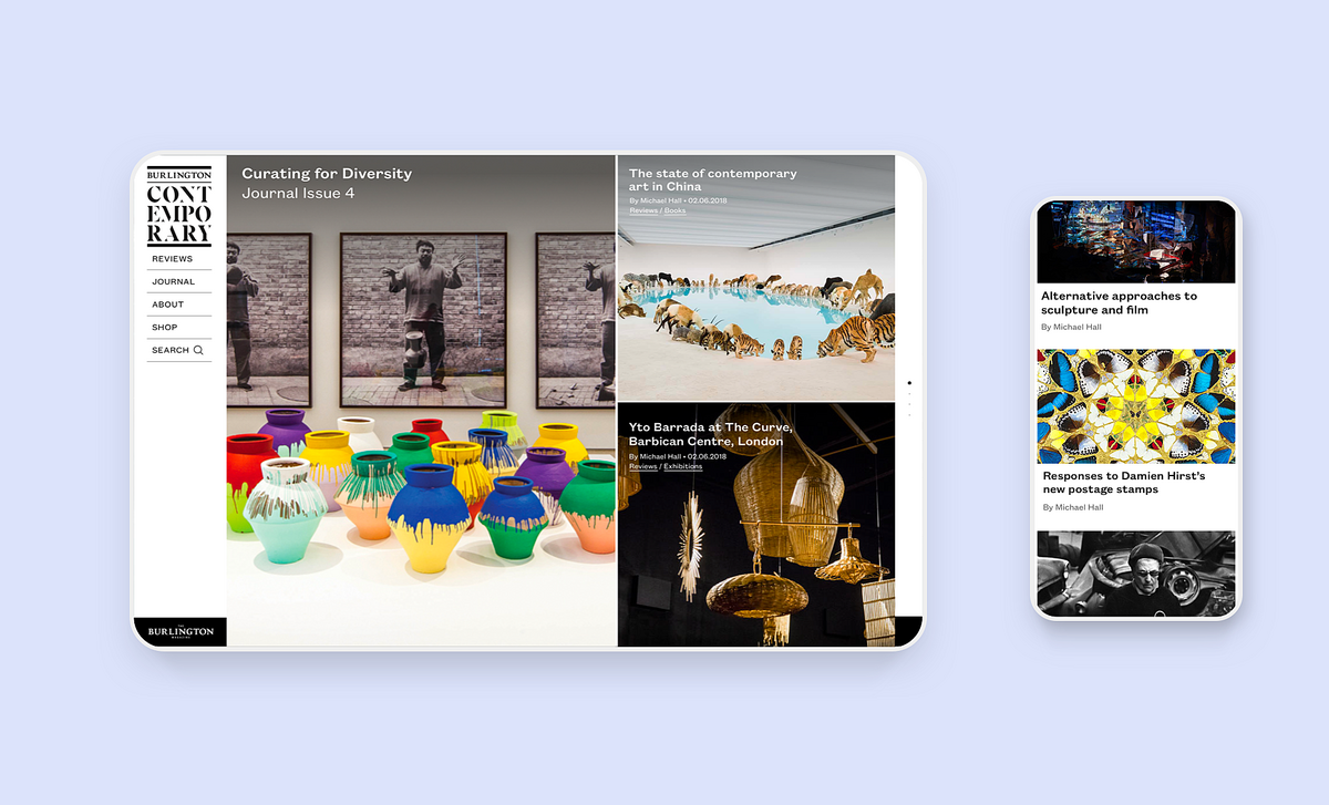
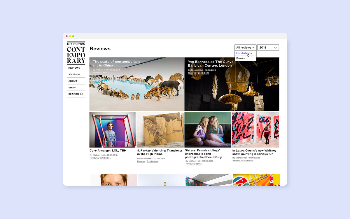
The reviews landing page echoes the homepage, with the two most recent reviews highlighted for the visitor. The visitor is able to scroll through the constantly updating content (two new reviews are published each week); as well as choose whether to filter between reviews of ‘Books’ or ‘Exhibitions’.
Journal
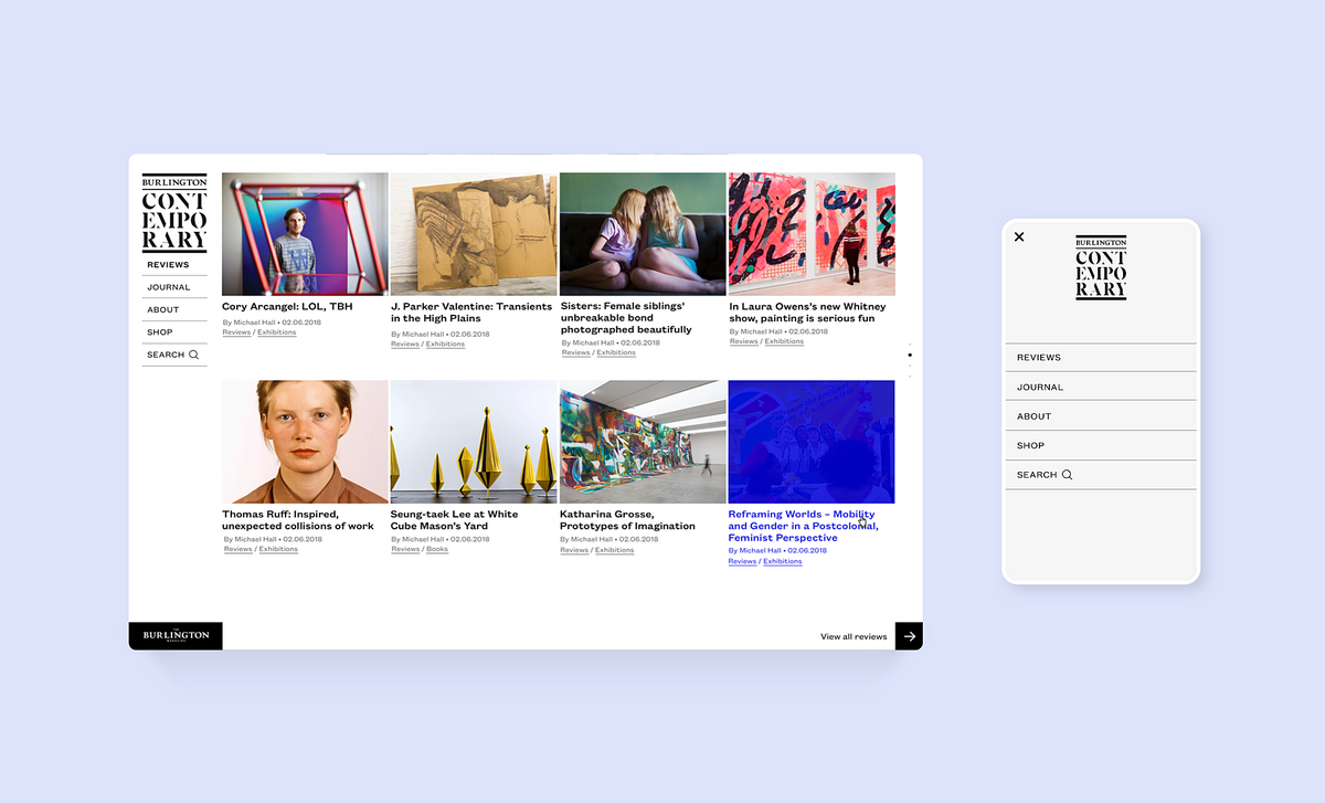
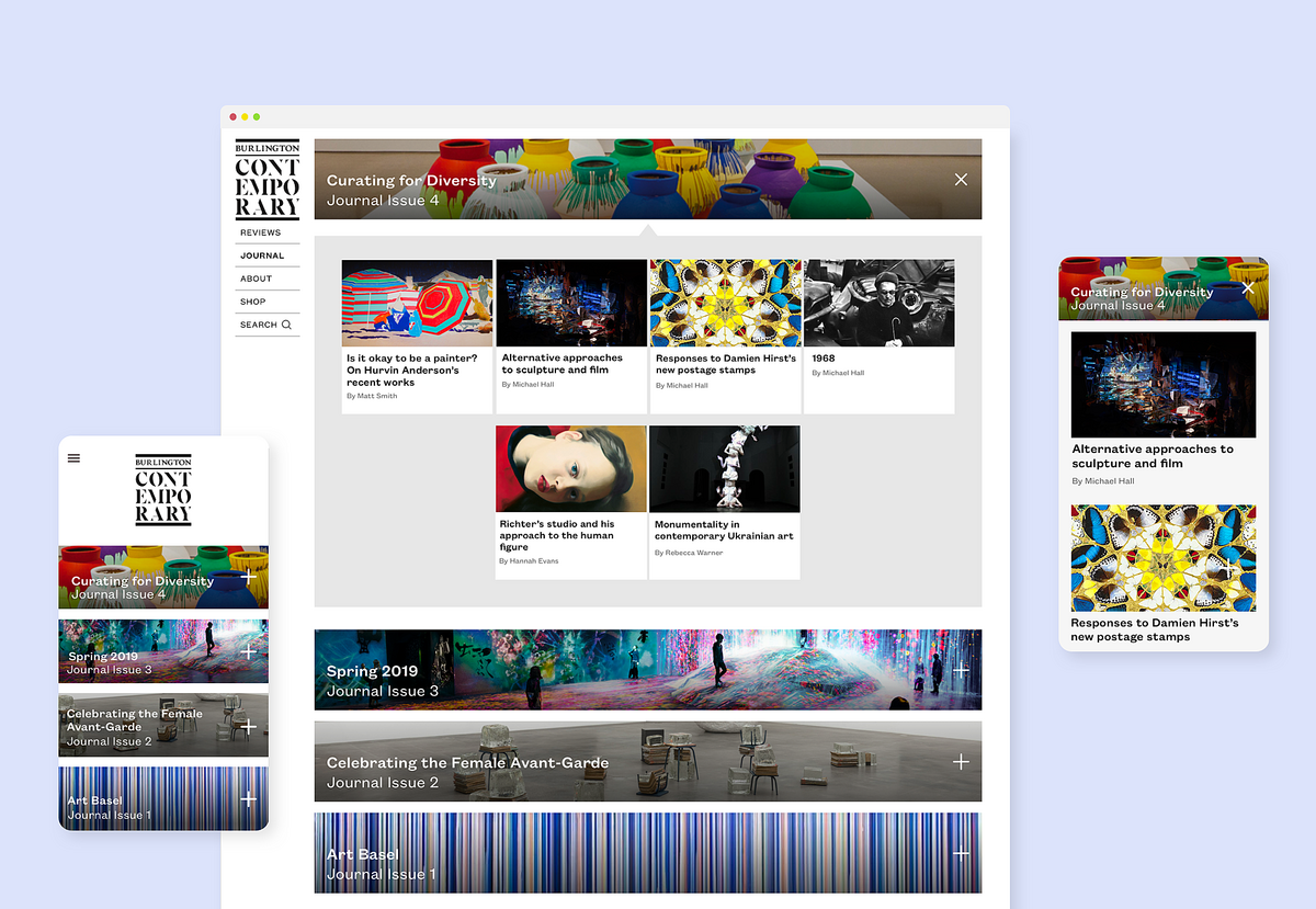
Each journal has its own individual identity, and its contents are held in a concertina. When the user lands on the page, the concertina for the most recent issue is open. This means the user does not have to go another page to see the contents of each issue, streamlining the user experience.
Articles
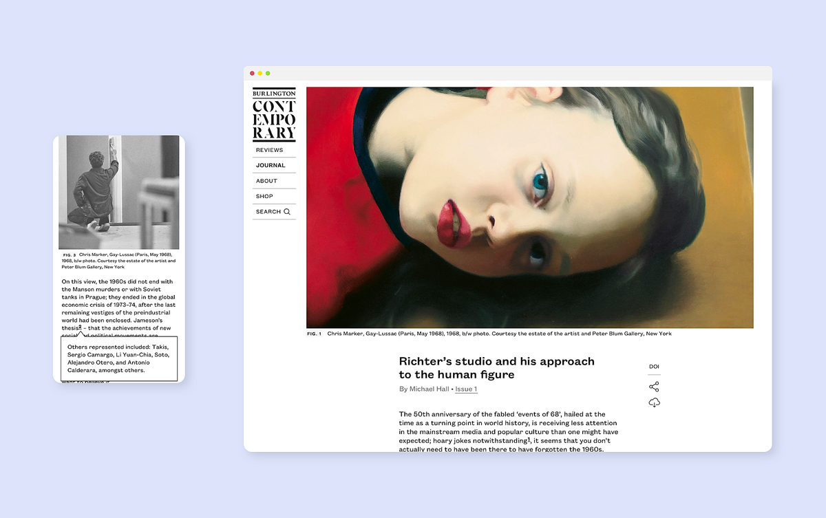
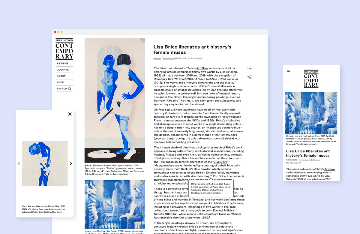
Long read journal articles are designed to be easy on the eye and guide the viewer through the long text. High-quality imagery can be seen in detail on a lightbox view that allows imagery to be enlarged and zoomed in. Being a publication targeted to the academic world, journals can be easily cited by a DOI, or Digital Object Identifier, a string of numbers, letters and symbols that permanently identifies an article or document and links to it on the web. Footnotes appear in popovers when the reader clicks on the footnote button, instead of taking the reader near the bottom of the page. In addition, articles can be exported to pdf, with a cover page/masthead designed.
Summary
Designing and building Burlington Contemporary we had to juggle building an online platform with the feel of a print magazine. Some of the challenges we faced were translating ideas from the printed page to the digital realm into cohesive interface designs. The site was launched successfully on Autumn 2018.
Related
The Burlington Magazine
Relaunching the website of the longest-running art magazine in the UK
British Art Studies
An innovative space for peer-reviewed scholarship on British art
Historic Texas Maps
Capturing Texas's historic landscape through an e-commerce website of over 40,000 records