Asia Art Archive
Crafting the digital presence for a unique repository of contemporary asian art, helping to manage a library and archive collection through Qi, publishing in English and Traditional Chinese.
Collections management, Data migration, Website design and development
Visit website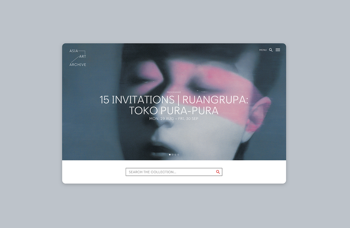
We helped Asia Art Archive enrich public understanding of the art in Asia
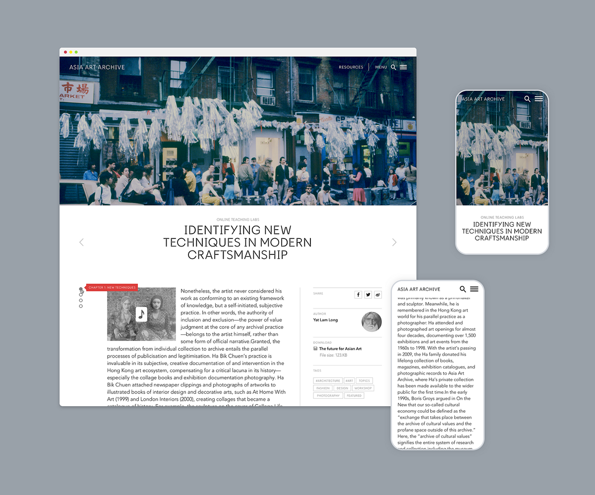
Hosting one of the most valuable growing collections of materials on recent of art from South East Asia, Asia Art Archive seeks to act as a catalyst for new ideas that enrich visitors' understanding of the world through the collection, creation and sharing of knowledge. We designed and developed the new website, creating closer links between the collection and the stories around it, with the Qi CMS used for collection management, as well as web content management.
Digital archive
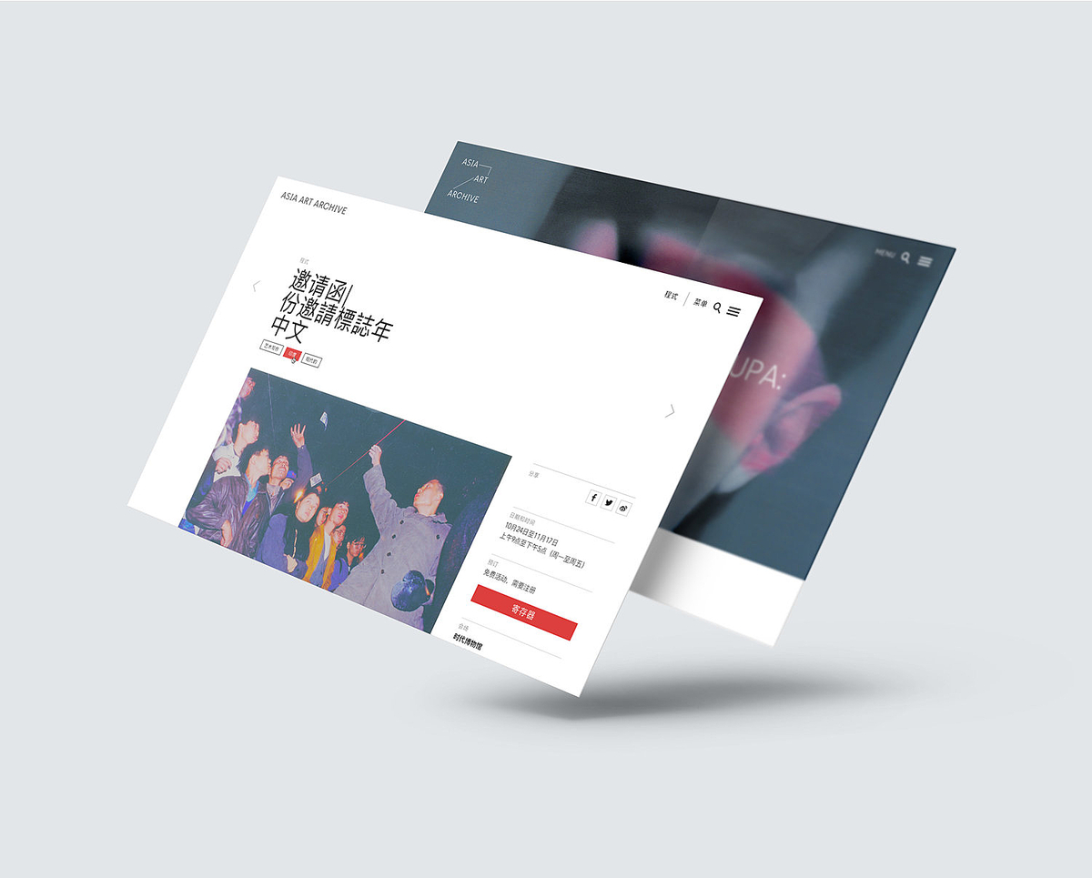
Asia Art Archive sought to have a digital presence to provide quick and intuitive access, interpretation and re-use of their digitised and library collections, educational resources and content on and beyond its own web presence. The digital presence is intended to be an open invitation to learn, understand and contribute to the development of knowledge of contemporary art of Asia.
Interconnected experience
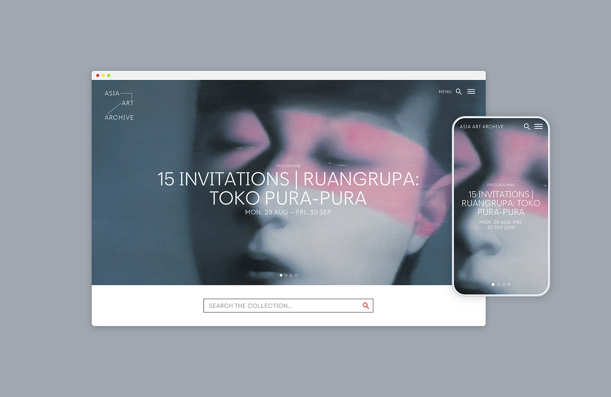
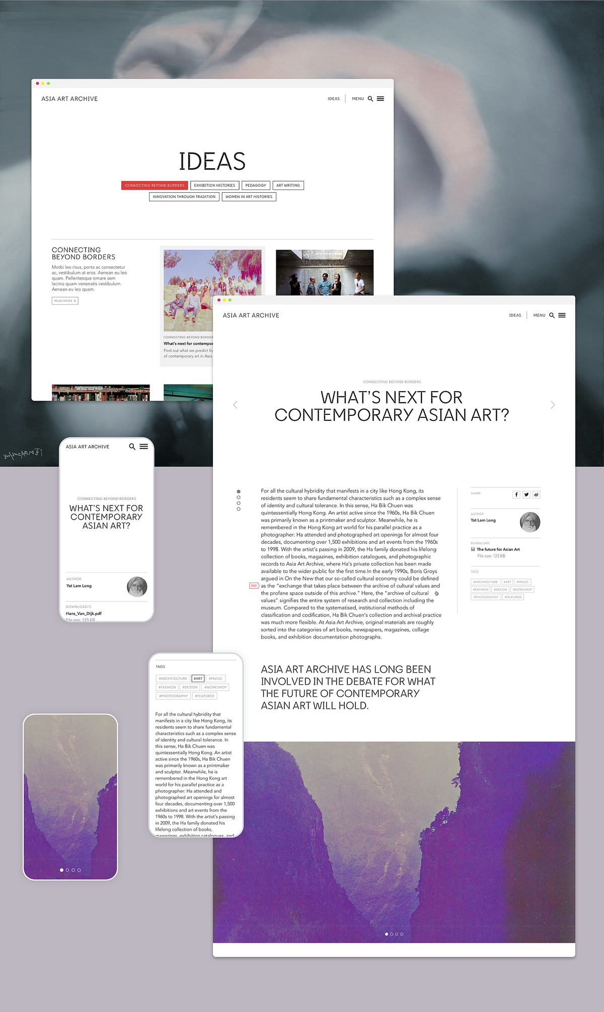
The website serves not only as an online archive but also as a hub for public programs, educational resources, curated content, and other materials related to the archive. Its primary goal is to enhance interaction with online visitors while also encouraging greater engagement with both the physical programs and the space that houses the archive.
Our approach
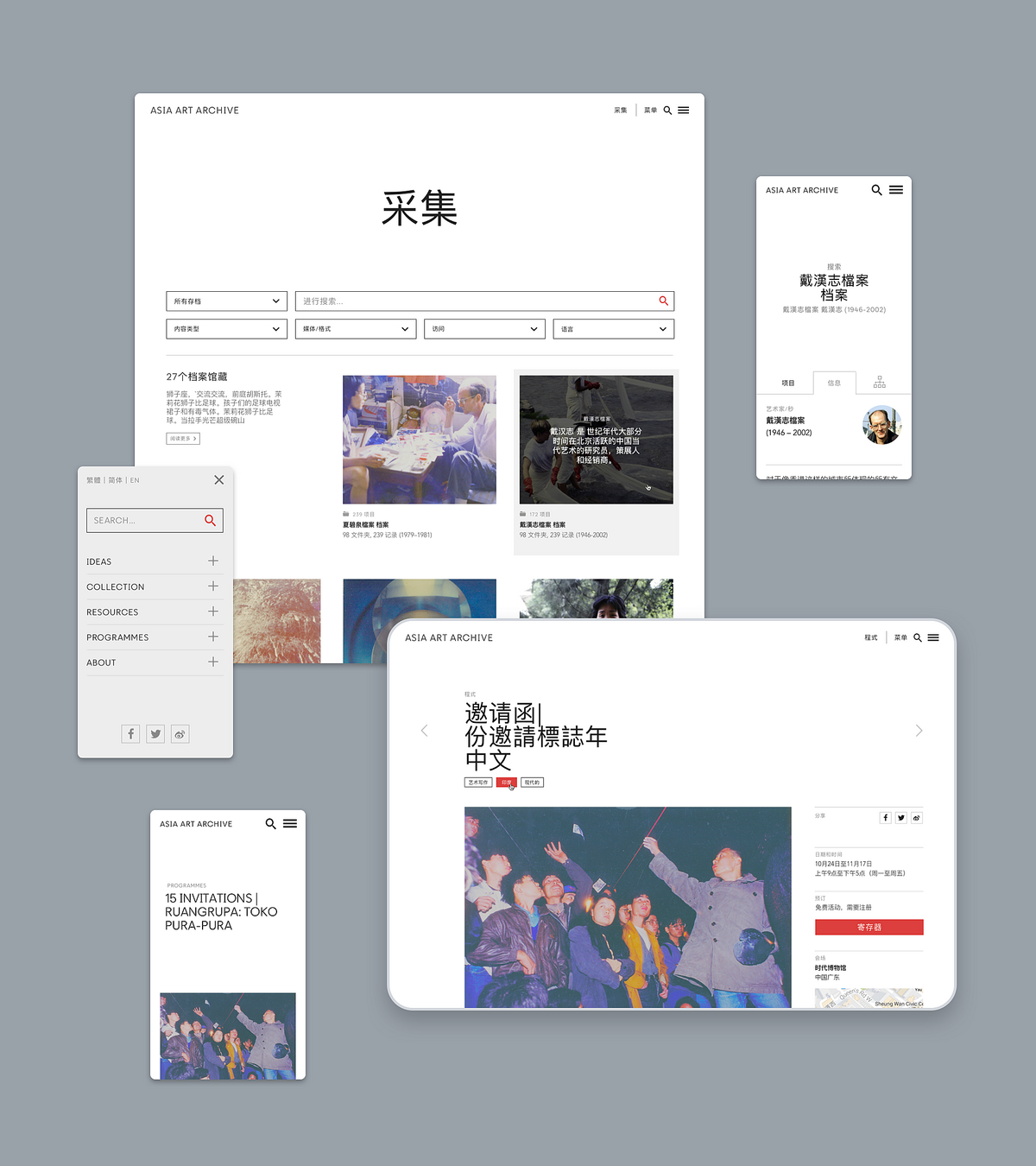
The design process was broken down into short, iterative steps, allowing for decision validation and risk reduction at each stage. From the start, it was clear that the archive collection needed to be the focal point, with an intuitive search and browse feature, along with visually organized results. Additionally, it was crucial to provide information about current events happening in the region.
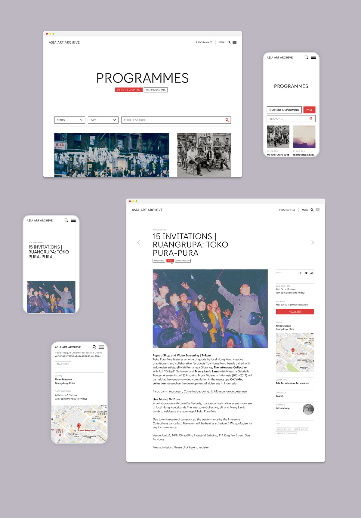
Exploring the collection
Curated highlights and an extensive, intuitive faceted search enable visitors to access and search the library and digitised collections in a variety of ways. Search criteria are kept on the screen when browsing results, allowing to constantly refine parameters. Users are able to sort their result and switch between layouts (grid and row) to change the level of detail they wish to see.
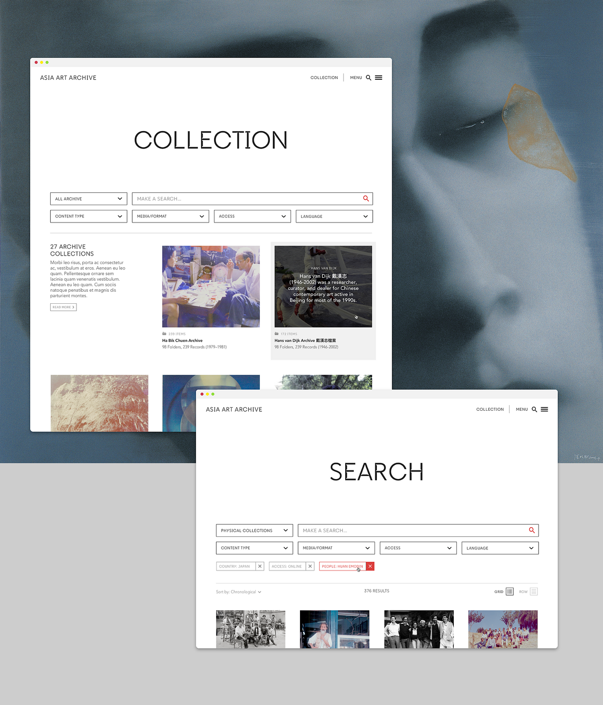
Hierarchal structure
The expandable hierarchy (from general to detailed) provides online visitors with context to archive folders and items. When expanded, the layout adjusts on the page so as to not overlay any content, while still allowing the content to be readable and usable.

At each level of the hierarchy, visitors can switch between seeing information about the series/subseries/folders, or the items contained in any of them. They can refine their browsing from the general to the detailed, interactively.
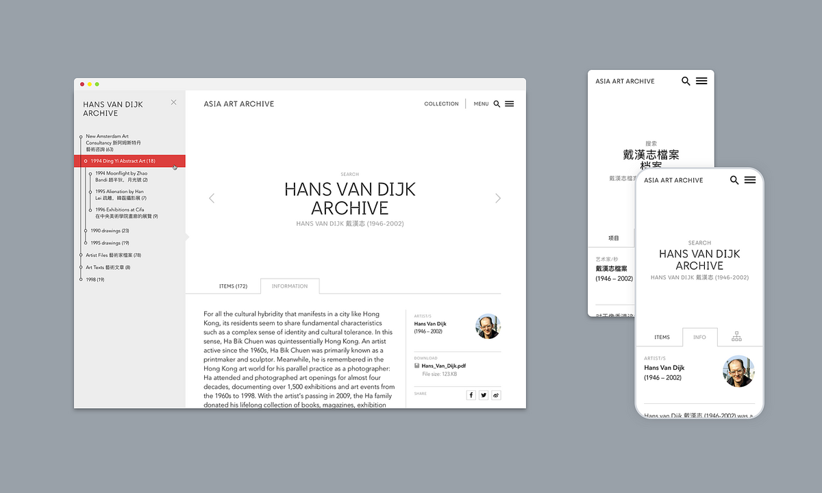
Narrative and curation
Editors can write narrative content that includes video, audio, documents images and link to archive items. Articles can be divided into chapters with anchors tools to facilitate scrolling to each section, in order to increase readability. Tags and related content help to keep users progressing throughout the site.
Digital impact
In the first three months since launch, there were over 28,000 users with 120,000 website page visits, representing a 70% increase compared to the previous website. Since then, usage has only increased, with viewership increasing since as well (a three month period at the end of the year had over 40,000 users and over 150,000 page visits). Visitors come from all over the world, including not only Hong Kong and the UK, but also the USA, India, Philippines, Taiwan, Singapore, China, Australia and Japan, with the balance of repeat visitors constantly increasing.
Related
Art UK
Harnessing technology to democratise the UK’s public art
Dia Art Foundation
A comprehensive digital landscape for this New York Art Foundation
Kemper Art Museum
Harnessing art, education and research to enhance digital engagement at the Kemper Art Museum